Wednesday, February 26, 2014

Behance: Go Brand Yourself!

Adobe Creative Cloud has creating a lot of different features that have enhanced the Creative suite and made different tasks easier for people to use and understand. One key feature though that Adobe has implemented in their movement to the creative cloud is the use of the portfolio site Behance. This site integrates work done in all of the Adobe products and allows users to post their work on the site in order to show off work in a social media atmosphere. This is a great tool for anyone in any creative field that needs a quick and simple place to post their work.

Portfolio sites like Behance are very important for people in the creative field because of how heavily these individuals are involved with creating brands and images. Many graphic designers who freelance or are searching for jobs try to display different logos and brands that they have worked with in the past. However, if these designers have no way to show that they can brand themselves, it can be difficult to gain the attention of potential clients and employers. The Behance site allows people to create an effective brand for themselves and lets them implement it throughout different social media platforms. This helps create the buzz needed for other users and studios to find different designer's work and possibly hire them.

Most importantly Behance's usability is quite simple, in the sense that it steers clear of differing from other social media sites. If someone has used Facebook or Twitter, Behance will be easy for them to pick up. Also, the integration with Adobe greatly helps out with the ease of posting projects. Along with all these features, Behance offers a ProSite application where users can create a more professional looking website that can bring your portfolio to the next level. Although ProSite costs monthly to use, the actual portfolio is free for anyone and it is a great way to create an easy site to allow you as a brand to truly shine through design community.

Below is a video on creating a ProSite, and here is a link to my ProSite as well. Enjoy!


Sunday, February 23, 2014

GE: Imagination at Work Campaign


In GE’s newest advertising campaign, a young girl explains the intricacies of her mom’s job. She mentions the progress of underwater power sources, the advanced mobile capabilities used by healthcare facilities and how her mom helps to create environmentally friendly trains. BBDO Worldwide created this story, which debuted on NBC to align with the network coverage of the 2014 Olympic Games at Sochi. 


BBDO is an award-winning agency with over 15,000 employees. BBDO has offices spread throughout 81 countries and is the second largest global adverting agency network.  Their acronym stands for Batten, Barton, Durstine & Osborn. They pride themselves on creating and telling stories. You may know them better for their cleaver AT&T “It’s Not Complicated” campaign starring the newest SNL cast member, Beck Bennett. Other accomplished works include the Bud Light’s Super Bowl commercial series featuring Arnold Schwarzenegger, and the talking animated M&M commercials.

What these ads have in common is BBDO’s self-prescribed ability to deliver a compelling story to engage an audience. For the M&M and Bud Light commercials they utilize humor and a little shock value. In the instance of GE, they tell a story through a child’s imagination to break down the complexities for the general public. The real task was for BBDO to communicate that GE is focused on big ideas that are changing technology and break it down so even a child can explain what they are accomplishing. They expect to create additional spots throughout the year, focusing on other areas of GE’s business, such as advanced manufacturing and affordable healthcare. I’m interested to see the visuals and hear how the story continues.

Friday, February 21, 2014

America... the Easily Distracted.


After the viewers of the Super Bowl were confronted with the Coca-Cola advertisement below, many opinions were voiced. Some referred to the mass voicing these opinions as a controversy caused by inferring that the advertisement was not as 'American' as it claimed due to its integrating of various cultures. In my eyes, the real controversy is slowly manifesting and unraveling but is currently cast to remain trapped in the desolation of silence- and maybe that is what Coca-Cola wanted all along.


Coca-Cola's strategy for this commercial certainly involved a soft sell, as it focuses more on manifesting emotion than its actual products. In fact, my personal opinion would say that this advertisement went way too far into the realm of the soft sell because when I saw it for the first time I was not concerned with the foreign languages and the united people of America-- I was wondering what the HECK this ad had to do with Coca-Cola. 

The hashtag for the commercial was #Americaisbeautiful. There was no verbal connection made between the concept in the advertisement to the brand. There was no typography that encouraged social media users to use that hashtag while enjoying the product. Nothing about this advertisement has anything to do with Coca-Cola, except the occasional drink is shown- but you have to look closely.

Moreover, something about this particular use of a soft sell and how the commercial barely fulfilled its branding duties unsettled me. Then I was in an Energy and the Environment course lecture- and it hit me.


It is of recent news that no longer can any Coca-Cola product produced in foreign countries still use raw natural cane sugar as its supplement for High Fructose Corn Syrup. My professor, Ed Schroth, noted that a gargantuan problem in terms of health for American's is, in fact and pun intended, obesity. In Coca-Cola's eyes this is a massive (again, intended) problem for their branding and product consumption as their products greatly contribute to this serious life-threatening condition. Clearly, Coca-Cola is NEVER going to utilize a hard sell technique in their advertisements. 
So just maybe, this whole "controversy" was easily predictable on their end- especially considering the demographic watching the Super Bowl in the first place. Anyone could have foreseen exactly what that advertisement would provoke out of some Americans.


P&G Pick Them Back Up- Sochi 2014

For teaching us that falling only makes us stronger. For giving us the encouragement to try again. Thank you, Mom. Learn more about P&G Thank You, Mom at http://www.facebook.com/ThankYouMom.

 At its very roots, the Olympics were designed to unite the world. So, it only makes sense that in the present times the Olympics are a televised event that unites millions and millions of viewers. Proctor and Gamble chose to construct an Olympic-themed advertisement focusing on another element that unites all populations across the globe- mothers.

Every scene in this advertisement was beautifully executed- from the actors to the actual Olympians and their mothers. The instrumental piano music is on point and adds a great deal of inspiring emotion. Rather than the "Tough" themed P&G ad, this advertisement uses the actual sounds of the sport and the raw, candid sounds of the verbal and nonverbal dialogue between the mother and her child-turned-professional athlete which added a more authentic and intimate tone to the commercial.

P&G utilized a soft sell strategy in this advertisement to pull at the heart strings of its mother consumers (and maybe even their adult children who would now also be consumers) however, the soft sell of the advertisement does not stretch so far into digression and diversion because an abundance of P&G are presumably mothers.

All in all, P&G took advantage of the Olympic trend and mass exposure and in the end they created an extremely memorable AND genuine advertisement.

Thursday, February 20, 2014

Samsung takes a stab at Apple


Apple inc. is well known for their sleek yet durable electronic devices that always seem to be pushing the envelope. Samsung, a direct competitor, has not let Apple get the best of them. These two companies have been rivals for some time now. With confidence, Samsung has taken a direct hit to Apple by targeting them in their most recent ad. This ad by Apple was used to promote their new iPad Air. A product that like other Apple devices, would set the bar just that much higher for direct competitors. 


Knowing that Apple is a rival of theirs, Samsung does a rather comical commercial in an attempt to prove to viewers that their Galaxy Tab Pro 10.1 is the better of the two. Samsung plays up their sarcasm by first talking about what it is the pencil has been known for. Then to go on and say that their tablet is thinner, and is better at multitasking; something im guessing the iPad might not do. Lastly they are promoting the HD screen that their Tab Pro 10.1 has by comparing it to the iPad while playing the same video. In all I feel as though these types of ad are not only confrontational to Apple as a company but also customers. Most people I know who have an iPhone or iPad love their devices and would never switch to a different device outside of Apple. In all this was a pretty risky ad in my opinion for Samsung however, it was memorable.

"Muttbombing" to Advocate Pet Adoption

When I think of animal rescue advertisements, the first commercial that pops into my head is always the ASPCA one with Sarah McLachlan. You know, that one that plays "In the Arms of an Angel" and shows all of the heartbreaking clips of neglected animals? I'm not sure I know a single person who doesn't change the channel as soon as that comes on the screen. It seems to me that most animal rescue organizations rely on this method to capture audiences, and judging by their consistency, they must be effective. Otherwise, why keep taking the same approach?


Because I'm so accustomed to encountering the tearjerking, heart-rending commercials of the ASPCA and other similar organizations, it was quite refreshing to come across a pet adoption campaign that used humor to engage its audience. Dallas Pets Alive! is a pet rescue organization that has decided to use the social networking app Instagram to spread their message, and they're doing it through photobombing. The twist? The photobombers are dogs that are currently up for adoption.

By photoshopping the dogs into people's "selfies" and pairing them with witty captions, the organization hopes to show people a different side of the potential adoptees. They've even "muttbombed" a couple of celebrities, which are pictured below.

Do you think this is more effective than the traditional approach to pet adoption advertisements?


Through the Eyes of a Child

GE is a well known company that prides themselves on building appliances, lighting, power systems and many more products that help millions of building, homes, and facilities around the world work more efficiently. Their slogan is "GE Imagination at Work." This is a great slogan because it really expresses exactly what they do as a company. In a recent ad, GE decided to show their company though a different eye.
It's common for children to have overactive imagination. When everyone see's a plane, they see a giant bird in the sky. This is an image that they portray in their ad. The ad does a great job of using the imagination of children and comparing them to the imagination of all those who work at GE. What I also though was interesting is that each child is talking of their mothers. This ad defiantly targets a female demographic by sharing that empowerment that comes with imagining something so technologically advanced and actually being able to produce it.

"It's about using the road as a canvas."

In 2009, the Pittsburgh agency Deeplocal partnered with Nike to create Nike Chalkbot, a machine used to print messages of hope and survival on the roads of the Tour de France.


Messages were received via Twitter, SMS, web banners, and wearyellow.com, then printed along 13 stages of the Tour de France. Those who had messages printed on the roads were also sent a photograph along with GPS coordinates. The Chalkbot took the media by storm and garnered worldwide attention, all through earned media.


This campaign is one that stands out to me for two reasons:

  1. The Chalkbot itself was unprecedented. It gave audience members a chance to have messages of remembrance, strength, and hope created into something tangible.  
  2. The project gave audiences the chance to engage in an unprecedented manner. The strength of the campaign was rooted in the audience's ability to create the messages themselves.

Can't Look Away

Back when I was in elementary school, we had an assembly about understanding advertisements aimed at us, kids. There were a couple women who had us watch a few different television spots that were airing at the time. They just had us watch a few then asked us a few questions about them. Unfortunately, I don't recall most of the ads and the discussion that followed them. I do remember the one that we spent the most time on though. The commandos ad from the Chef Boyardee "Feed the Need!" campaign:


This ad highlighted key points they wanted to cover, but primarily the idea that rapid frame changes keep eyes on the screen. The ever changing camera angles in the ad keep viewers' attention since there is a constant stream of new information your brain is trying to intake and understand. This still works well on adults too, but keeping the attention and gaze of children's eyes was a trend in all of those ads we saw that day.

There are plenty of other techniques being used in this and other ads in the campaign - which stand out to you? Most importantly, all those years ago in that assembly we were asked to try and count how many frame changes there were in this ad. How many can you count at normal speed? Or even with pausing?

How Much Is Too Much?


One of the latest crazes on Facebook is its ability to predict when two people are going to change their relationship status from "single" to "in a relationship." According to Mashable, Facebook analytics now have it down to a science. The prediction is made three months prior to becoming in a relationship, based on wall posts, and status "likes." As well as, key words such as love, nice and happy that help determine the stage of the couple's relationship is in.

In a world lacking serious privacy as it is, is this going too far? What happened to intimacy? The whole fun of getting into a relationship/dating are the moments that lead up to being "official." Relationships are meant to be shared between two people, not two people and Facebook. In today's world a simple Google search will tell you everything you want to know about a total stranger. Isn't it sometimes better to just sit back, and enjoy the ride?

http://mashable.com/2014/02/14/the-fascinating-anatomy-of-a-facebook-relationship/

You Are Your Audience


There are many different ways to advertise to advertisers, but I would like to focus today one particular strategy. Whether you area large communications company, like Martini Media, or a site trying to attract advertising interest for yourselves, connecting yourself with your audience is an ultimate goal. Advertisers are interested in their prime prospects when it comes time for media buying. The audience is the reason why anyone looking to purchase ad space in your medium is there. The deeper the connection you can prove to your audience, means more interest in you from those trying to reach them.


Martini Media does an amazing job at this. Not only does Martini reinforce the connection to their audience everywhere, but they also amplify the importance of the audience. I recommend exploring their site (link above) to see all of the little details of this.

Would paid advertising and social media go against Sriracha's brand image?

It was named best-tasting hot sauce by Cook’s Illustrated, and is frequently featured on the Food Network and popular TV shows such as The Simpsons. Twenty million bottles were sold in 2013, and it was the subject of a highly praised documentary which was released the same year. It probably comes as no surprise that Sriracha (also known as “rooster sauce”) is one of the fastest growing food companies in the United States. What may surprise you is that it has reached its iconic status without a single paid advertisement.


You’d probably be hard-pressed to find an iconic product that got to where it is today without any paid advertising. Sriracha doesn’t even have a Facebook or Twitter account, and they haven’t updated the website since 2004. The reason behind the company’s decision? One of them involves production limitations. David Tran, owner and creator of Sriracha, only uses chili peppers obtained from Underwood Family Farms, about an hour north of L.A. This is done in order to avoid fluctuating prices with larger suppliers, and also to ensure a fresher product. Smaller farms, however, mean less product, and the company already has a hard time keeping up with consumer demands. Tran chooses not to advertise because “we can’t promise something that we don’t have.” He’s also known for his extreme modesty, which probably has something to do with the company’s lack of online presence. 


Taking all of this into consideration, I can’t help but wonder where Sriracha would be if the company chose to work with larger suppliers, invest in paid advertisements, and utilize social media. Would advertising efforts go against their brand image? Would it damage their reputation? I think that one of the best parts of the product is the fact that it maintains the humble image it’s had since Tran first created it. It’s also one of the things that, I believe, contributes to the company’s increasing sales. The lack of advertising generates a certain degree of curiosity amongst people who may not have tried it. It creates a greater sense of community amongst those who use it. Lots of people have even described it as being a cult following. 


What do you think of Sriracha’s decision to not advertise? Would advertising and utilizing social media be beneficial or harmful to the brand?

Build With Chrome

Has the release of THE LEGO® MOVIE made you wish you still had your giant collection of colorful plastic bricks? Want a huge kick of nostalgia?


Google Chrome and LEGO have teamed up to make way to not only build with the studded bricks without the risk of stepping on one with bare feet, but be social and interact with Google Earth! The effort was/is being used to promote LEGO, Chrome, Google+ accounts, and of course, THE LEGO® MOVIE. If you ever played with LEGO as a kid this is really worth checking out. This is definitely a prime example of creative projects that did not start off as an advertisement, but turns into something worth people's attention. So keep on using your imagination and creating even if it's not for a client, you never know what you'll make or how it will be used in the future.

#WHATSTHERE

This 60 second advertisement for the 2014 Winter Paralympics shows viewers just how amazing these athletes really are. The ad starts out with a wide view almost hiding the whole image from the viewers. Doing so makes viewers feel as though that are simply watching the Winter Olympics. Its not until halfway through the ad does the image get larger therefore showing the viewers exactly which winter Olympics they are advertising for.


Whats most interesting is that at the beginning of the video you would never know that these people are disabled in any way. At the end of the advertisement it says, "It's not whats missing, it's whats there." These seven words do an amazing job of summing up everything these althletes live by.

Esurance Save 30

Everyone in world knows the Super Bowl is a huge event. Even countries that don't know what football is know about the Super Bowl, and even when the game doesn't give you much to talk about for the weeks after the commercials will. One of the biggest commercials from this year's Super Bowl didn't come till minutes after the game. Whether viewers stuck around to watch the ad or not, they probably heard about it in the following days. 


The Esurance Save 30 ad did what advertisements should do. They took a simple idea and made sure that everyone knew about it. Esurance is an online insurance agency that started with a simple idea: insurance online with less paper. They also started by using cartoons as advertisements. Since then they've taken a step in a different direction and have been using John Krasinski (The Office) to narrate their ads. With this ad Krasinski became the face of the company as well, even though his celebrity status might get ignored in the wake of the ads huge results. 

Advertisers claim to have saved 1.5 million dollars by airing the commercial minutes after the Super Bowl ended instead of during the game, and offered to give those savings to one lucky twitter user who used the #esurancesave30 hashtag. According to Time Business 200,000 entries came in only a minute after the commercial aired. 24 hours later there would be another 2 million entries to go along with those. Esurance's twitter following also exploded from 8,900 to more than 110,000. Esurance made a contest that had huge stakes so easy to enter people felt like it would be stupid not to sacrifice a tweet and enter, and the company saw a huge awareness payoff thanks to it.


For Your Eyes Only

"My first, I was 16."

"I was like a freshman, probably."

"I wanted it for a very long time."

"I lost it in the woods."

"I want it." "I need it."

Of course, all of these quotes are talking about cell phones. AT&T is currently promoting their AT&T Next℠ plan which includes an internet video ad that starts off with these implicative hook statementsThe young, tattooed actors delivering racy lines was shown on a website whose audience are primarily males, ages 18 to 34 years old. After these edgy statements, the ad then reveals that they are in fact talking about their cell phones. You will have to trust me however. There is all but no trace of the ad to be viewed on further inquiry anywhere, unlike other current and past AT&T ads.


Audience segmentation may not be new, but the actively holding back an ad from the greater public is something that many of us don't consider. With such a large clientele base, companies like AT&T can avoid negative associations and controversy from non-prime prospects with strategies like this. The ever increasing levels of control advertisers have over who is exposed to a message can lead to many great things. Who knows, we might see a day when no one thinks how pointless or offensive that last ad they saw was since you will never see an ad made for another type of person.

Stage Your Own Winter Olympics


With the Winter Olympics occurring every four years, views look forward to the opportunity to be dazzled by their favorite athletes from all over the world. Its the chance to come together and cheer on your country in their quest for gold. In terms of advertising, the Winter Olympics are a time for companies to gain recognition as sponsors of this international event. Samsung, an electronic company from South Korea, has utlilized the 2014 Winter Olympics as their chance to not only relate to viewers but also to gain brand awareness for the quality and services they offer throughout their electronic devices.


In this advertisement, Samsung is promoting their Galaxy line by visually expressing ways in which both kids and even adults can become inspired by playing out their favorite events all within the comfort of their homes. Whether it's becoming a Bobsled Olympian while sliding down a mountain in the bathtub, or skiing down your very own steps right to a gold metal, Samsung promotes the imagination that not only they possess as a company, but also their consumers.

Packaging Trends: Why to keep the box after it's opened.

Packaging has been a very important aspect of brand identity for quite some time. As a result of implementing more digital oriented content for entertainment media and software, packaging has become a smaller focus for some companies. Before the evolution in music technology from compact disc to MP3, there was always a very artistic and important role that packaging design had for this medium. Opening up the booklet and album cover for a CD was an entertaining way of interacting with the album, by placing a visual aspect to correspond with the audible elements that the album gives off. This was an even bigger deal when records were popular, mostly because of how large of an area they had to work off of, but there was also a very timeless idea behind records. They were collectables because of some of the artistic elements that they have implemented, but usually records contain other pieces of visual aids, such as posters and stickers. Even movies and software have been replaced by its digital downloaded counter part.


Despite the dwindling need for packaging these entertainment items, there is still a great need for some companies to create and implement unique packaging to give brands an identity that can be utilized in  store fronts. One more obvious brand that designs clean, crisp packaging the represents their brand perfectly is Apple. After purchasing an item from the Apple store, people can spot the product from a distance. Some of their larger products, such as iMacs, MacBooks and MacPros have all been placed into a carrying case that carries all of the elements and instructions to the product. This makes it easy for the consumer to carry it out of the store, while displaying the product to everyone around them on their way back to their transportation or home. This is a great strategy that Apple uses to turn their products into walking advertisements. This idea has come a long way since the original packaging for the first mac computers. Altogether, this evolution in their packaging has been a large role in Apple's brand. This trend has also become more popular in many other products as well. Food and beverage packaging are another huge portion of companies that utilize packaging in this manner. Therefore, despite many companies and brands going paperless with their products, there is still a great need and desire to revolutionize packaging for consumers.
128k-Mac-packaging-1-sm.jpg
Original Mac Packaging

Check-Out-The-Cool-Box-Holding-Your-2012-iMac-2.jpg
New iMac Packaging

FDA: Cigarettes are "Bullies"

Anti-smoking ads are notoriously clever and sometimes disturbing. In a recent TV spot by the FDA, they take a new twist on the impact of cigarettes, comparing them to a high school bully that pushes you around and manipulates you. In this ad, a little man (with a ridiculous mullet) won't leave a certain teenager alone. He says things like "We're going for a walk" or "we pause the movie when I say we do" and drags him around from place to place by the neck. When I first saw it, I had no idea what was going on, which was probably the intent. But as the little man climbs between the teenagers fingers at the end and the narrator states "Cigarettes are bullies", the entire ad clicked for me. It was very creative and made me think, and I enjoy seeing the powerful metaphors that the FDA and other anti-smoking campaigns create.


Wednesday, February 19, 2014

The Future of Print Advertising


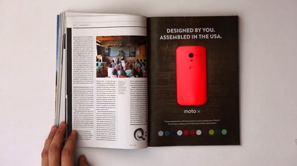
This past January, Motorola ran an interactive ad campaign that took print advertising to a whole new level. The full-page advertisement was printed in approximately 150,000 copies of Wired magazine, and combined paper-thin batteries, LEDs, buttons, and plexiglass in order to demonstrate the customizable color feature of the new Moto X phone. 


Design Elements


The ad, with the exception of its electrical components, is simple in design, and utilizes white space in order to bring the reader’s focus to the center of the page, where the LED-lit phone is featured. The phone itself is framed by minimal copy, which creates not only balance, but also contrast due to the white lettering layered over a dark, woodgrain background. Color-coded buttons at the bottom of the page also provide some contrast and complementation.


In My Opinion…


Motorola’s ad was a huge success, design-wise; it’s visually stunning, highly engaging, and unforgettable. I can’t wait to see what’s next for this medium, and I’m especially eager to see how the company’s competitors will react. What do you think? Are battery-powered, interactive ads the future of print advertising?

Want to read more about this campaign?


Coca-Cola


The competition between the competing companies Pepsi and Coca Cola is nothing new.  However, it has been discovered that Coca Cola’s profits have been going down.  The CEO, Muhtar Kent, believes social media and marketing is the best course of action.  Is it possible that this "best course of action" may have decreased sales from the beginning?  Coca Cola aired a controversial ad during the 2014 Super Bowl.  Though this ad may not seem controversial to some, the strategy of placing multiple languages in the advertisement has been a hot topic.  America is considered the melting pot of all cultures, which this ad conveys.  However, some believe it supports emigration.  Despite this ad, Coca Cola plans on increasing their media spending to $1 billion by 2016.  With this budget they hope not only to increase sales in North America but globally as well.  Coca Cola has been successful in producing global ad campaigns such as the Share a Coke campaign which was launched in Australia.  This campaign increased the declining sales in the country of Australia by placing names on Coca Cola cans.  With this new budget, there are multiple advertising tactics that could be utilized in order to increase sales. 


"Coca-Cola Boosts Marketing Spend as Demand Slows |News - Advertising Age." Advertising Agency & Marketing Industry News - Advertising Age. N.p., n.d. Web. 19 Feb. 2014.

“Before Your Back Attacks You”


An Israel based advertising agency, McCann Erickson, created this print ad to promote Ashtanga Yoga’s benefits for back problems in 2014.  The ad utilizes a large amount of white space, drawing attention to the ad.  A spine is formed into a type of serpent ready to strike, suggesting that it is similar to back pain.  All of the text is printed on a partially rolled up, red yoga mat.  The mat is the only color used in the ad, bringing the eyes’ focus directly onto what the text says.  The headline states, “Before Your Back Attacks You.”  The headline is creative and connects with the picture of the spine.  The sub-headline reads, “Ashtanga Yoga at the Garage Club,” and then printed underneath is the logo. 


The ad is primarily simple in nature, bringing most of the appeal to the serpent spine.  It then uses the color red to draw the eye to the yoga mat at the bottom of the page.  The yoga mat is rolled up which could be difficult to deifier what it is, if one is not familiar with the activity of yoga.  The text is simplistic in nature as well, and the headline and subhead line are both clear and understandable. However, the text is quite small.  The agency could have possibly utilized the yoga mat a bit more in the ad, to enlarge the text as well as show that it is indeed a yoga mat.  By making these adjustments the ad would be a bit more approachable.   However, overall the ad is well executed and the picture and text are complimentary to one another.  


"The 5 best print ads of 2014 so far | Print design | Creative Bloq." Creative Bloq | Your daily dose of design tips and inspiration | Creative Bloq. N.p., n.d. Web. 19 Feb. 2014.