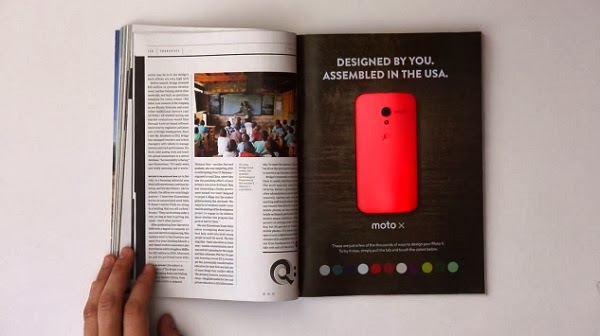
This past January, Motorola ran an interactive ad campaign that took print advertising to a whole new level. The full-page advertisement was printed in approximately 150,000 copies of Wired magazine, and combined paper-thin batteries, LEDs, buttons, and plexiglass in order to demonstrate the customizable color feature of the new Moto X phone.
Design Elements
The ad, with the exception of its electrical components, is simple in design, and utilizes white space in order to bring the reader’s focus to the center of the page, where the LED-lit phone is featured. The phone itself is framed by minimal copy, which creates not only balance, but also contrast due to the white lettering layered over a dark, woodgrain background. Color-coded buttons at the bottom of the page also provide some contrast and complementation.
In My Opinion…
Motorola’s ad was a huge success, design-wise; it’s visually stunning, highly engaging, and unforgettable. I can’t wait to see what’s next for this medium, and I’m especially eager to see how the company’s competitors will react. What do you think? Are battery-powered, interactive ads the future of print advertising?


This is really impressive, and probably cost a fortune. I feel like this is the beginning of hybrid digital/print ads. What was considered impossible or unthinkable 20-30 years ago exists today. I predict that paper-thin screens will exist in the near future, in magazine and newspapers (if they are still around)
ReplyDeleteI have to agree with Keith, Motorola is pushing the envelope with this type of ad and I personally feel as though it would be a huge success. In terms of price it will probably be more costly, however, to make a print ad more interactive is huge deal. Gaining that interaction with your audience is whats going to make it more memorable.
ReplyDelete