Wednesday, February 22, 2012

Smoking = Death

anti smoking advertisements 06 in The Best Anti Smoking Advertisements

antismoking ad
http://www.funny-potato.com/anti-smoking-ad.html

It is no secret that these two advertisements are anti-smoking ads.  They are very clear and my opinion quite creative.  Both of the ads are targeting the audience's heart more than their mind.  The first ad figuratively demonstrates a person being hung.  This shows that the person smoking chooses their death.  The second ad is targeting both smokers and non-smokers.  It is a risky ad due to the fact that 9/11 was a tragic day in America and relating smoking to a terrorist attack could cause some uproar.  I believe that this ad is very powerful and that all viewers can relate to.  The audience gets a feeling of hate when they see the cigarettes resembling the Twin Towers and these feelings are carried over to the message that is being told.  Both advertisements do a good job targeting the heart, but the second one in particular nails it.

PROGRESSIVE


video:   http://www.youtube.com/watch?v=uqvKOez0XV4

This commercial obviously targets people who are looking for insurance, but even for those who are not currently seeking it, it keeps the Progressive name in their heads.  Myself for example, I am not currently seeking insurance, but when that time comes I will most likely give a look at Progressive because their name has been engraved in my mind for a long time.  This commercial uses multiple strategies.  They obviously have the humor aspect, which has helped them become more memorable now that Flo has become the face of Progressive, but they always make sure to include the important things they offer in their commercials as opposed to some companies that just want you to see the name and remember it.

In this commercial they are advertising multi-policy discount, paperless discount, homeowners discount, and safe driver discount; all of which she names in her sleep, followed by some humorous random dream speech that even little kids can laugh at.  AND, if Progressive is still around when those younger crowds become adults and start looking for insurance, I'm sure they'll remember Progressive as an option.

Brown M&Ms


video:  http://www.youtube.com/watch?feature=endscreen&v=q33drZUXSzY&NR=1

This M&M commercial is another one that appeals to many audiences.  Not only is this because the product itself has a broad range of consumers but because the message is easily understood.  That being said, the message doesn't necessarily tell us anything about the product except for M&M has come out with new brown M&Ms, which had not previously existed.

Another strong part of this commercial is the music they use.  Especially since the song is a current popular one it's definitely one thing that would draw the attention of someone who was not already paying attention.  All they need is a glance to see that it's M&M, a name we all are familiar with, and the commercial has done its job.  Also, since the color of the M&M is for the most part irrelevant to the product - except for specific holiday packs - the point of the commercial is to remind the viewer of the  brand at least.

Fashion Advertisement


This is an advertisement for Printemps f/w 2011 campaign. Printemps is a french department store almost like our Lord & Taylor or Begdorf Goodman. This was one of the campaigns I had a chance to work on while doing an internship with a fashion ad agency this summer. I am going to go through the different steps that lead to this final ad.
Through multiple meetings and creative ideas, it finally came down to the clothing that was going to be used in this advertisement. This is a full Gucci f/w 11 look. It was important to understand what Gucci was aiming for with that seasons collection. When I first got to my internship, It was my job to find flowers that were well crafted and constructed. My bosses liked the idea of a rose. Then, it was my job to find a different flowers that went with the theme along with flowers that matched the colors of the looks pulled for the photo shoot. After searching for about a week, I found this lovely and exquisite blue rose. It was perfect for the shoot and matches her blue gloves that top model Raquel Zimmermann wore. The color of the background comes from the different colors in the season and was chosen by the creative director at the shoot. It was an amazing opportunity to be apart of this advertisement and I look forward to doing many more in the future with different luxury brands.

HERE WE GO!


video:   http://www.youtube.com/watch?v=hyFWSys3TJU

This commercial is for Bud Light, which is one of the top selling beers in America.  This commercial appeals to everything guys like, parties, dogs, and especially beer.  The Bud Light slogan "Here We Go" is incorporated into the commercial through the dog who is conveniently named "Wego".  Whenever someone calls him saying "Here, Wego," he fetches a beer for them!

Not only did they come up with a creative way to incorporate their slogan into the commercial, but they also incorporated a positive message: animal rescue.  The man in the beginning of the commercial says that he's rescued a dog, then at the end of the commercial there is a cooler with a facebook page written on it to support animal rescue.  By doing this, Bud Light is attaching their name to a positive cause, which not only makes them look good but also uses their popular name to help a better cause.

Sock Innovations


video:   http://www.youtube.com/watch?v=eTpG37OvjFs

First and foremost, I think this commercial is hilarious, which is the main reason I am doing a post about it.  I think that commercials that are funny are the most memorable to the largest group of people.  That's not a fact from any sort of survey, I'm only assuming.  But the funny commercials must be done right, which also makes them more difficult, because the humor has to appeal to everyone.

The humor also has to make whatever statement the company is trying to make about their product.  In this case, it's the "Comfort Fit" socks, so the dad is trying to make a solution to their poorly fitting socks.  Luckily, Hanes has a more practical solution, which is their "Comfort Fit" socks.  By using this simple humor they make the message more understandable to a larger audience.  Therefore, next time someone is searching for socks the Hanes brand name will stick out in their mind.

KAFA- Verbal Abuse


This Kafa ad was also nominated as one of the top 30 Amazing and Powerful Public Interest ads of 2011.

At first glance, you automatically assume they are promoting against some type of physical abuse. However, upon closer inspection of the text, "Whore. Words hurt. You can't see them, but the scars from verbal abuse are real and can last for years. Don't suffer in silence." In this instance, both the copy and visuals come together perfectly to better convey the message of anti-bullying.

The ad goes as far as to imply that verbal abuse can be just as painful as physical, and can last a lot longer. It may also play on viewers feelings of guilt for perhaps being that bully who caused someone else emotional distress. The ad associates hurtful words with punches or blows to the face, and definitely gets its point across clearly.

It is also interesting that the woman being portrayed in this ad is very attractive, which may also play into the "whore" wording used. I think the ad is trying to get across that anyone, no matter what you look like, can be the victim of verbal abuse. And if you are a victim and need help, reach out because Kafa is there to aid you.

This ad was found at littleboxofdesign.com/?p=1960

Don't Talk While She is Driving


This ad posted by the Bangalore City Traffic Police, was nominated as one of the top 30 Amazing and Powerful Public Interest Ads. And you can definitely see why.

The ad is quite graphic, and gets it's point across immediately. The text says, "don't talk while she drives". But really the text isn't even needed to understand the context of the ad. When determining whether the Traffic Police are going after the targeted customer's head or heart, there is no denying the heart is what they are after. You almost get a gut-wrenching feeling when looking at the man grimacing while being sprayed by the blood. It pulls at your heart strings even more, because when the text says "she", you automatically think of his girlfriend or wife.

Because the ad is so distinct, you're gaze lingers on it and you take the time to fully grasp the message. And the message clearly states, encourage your loved ones not to talk on the phone while they are driving because you could be the cause of their death.

Perhaps this ad would be a bit too graphic for the States. I believe advertisers here would probably try to find a more roundabout way of getting this specific point across. Either way, it is moving and it has the ability to shake anyone reading it. Because lets be honest, who hasn't talked on the phone while they're driving, let alone be the person that someone else is talking to.

This ad was obtained from http://littleboxofdesign.com/?p=1960

You were once 16, maybe you should watch...


In the public service announcement, produced by the David Cornfield Melanoma Fund, is one of the most effective advertisements for bringing awareness that I 've ever come across. Produced around two years ago, the video, shown on YouTube, has received over 5 million hits.

The video's length is five minutes and four seconds long; this is the only downfall I see the short film having---regarding the target audience's attention span. It goes through several talking heads who have once been diagnosed with skin cancer or knows someone who has died due to the cancer. These are real life people with a story and a well thought focus to run throughout the psa. The title, "Dear 16-old-me," gives it all. Each person is talking to themselves, as if they could when they were 16. It has comedic appeal from a character to give humor; it gives sincerity from real life stories, and even though it gives sadness, it gives the viewer a hard hit to reality.

Comments left by people were thankful and inspired. This psa advertisement gave and is giving people a push to get themselves checked out for a dangerous cancer that affects many.

A plain-gray background is all you need behind a story of inspiration, the words and faces are everything.


Models and McDonalds

When I think of McDonalds, one of the last things that come to my mind are models. This advertisement was ran in Ebony Magazine in 1992. Just goes to show how times have changed and how much information we have gathered from the serious health problems that come from fast food consumption.
The whole ad is portraying a model during a photo shoot. Photo shoots can last all day and can be very boring / tiring to the models. The tag line in the copy is "You'll get the picutre". The model on one side is cut out and the copy and McDonalds logo is placed inside. It reads that you cannot resist the great taste and prices at McDonalds. Even models think and craze the irristable food that McDonalds serves. Looking at this ad today, is this all true that she would be thinking "I'd rather be at McDonalds" ? Models have to maintain a certain body image and weight and from all of the information we have about the quality of their food, I do not think that there would be an ad like this produced by McDonalds today. It is very contradicting and could be misleading. People may think that they could look like that if they eat McDonalds. It also says that models eat and crave McDonalds. For the time, this ad may have been very effective because people were less concerned with obbesity in this country and did not have all of the factual information regarding McDonalds food. What do you think? Is this advertisement sending the wrong message or is it a brilliant attempt to get more people to eat at McDonalds?

Tuesday, February 21, 2012

Gone Country


I grew up listening to country music, so I like to watch some country music videos on CMT and GAC every once in awhile. I know that not everyone listens to country music and it typically attracts a particular group of followers. The same holds true for the television shows aired on these networks (Bayou Billionaires, anyone?). Now, I usually only watch these networks simply for the music rather than the television shows, so I never really paid attention to the advertising. But the other day I did see a commercial that caught my attention. And then I realized how media placement can make or break an advertising campaign.

Most of the television shows that I watch are on the major networks like CBS, so I see a lot of the same commercials that appeal mostly to families, such as food products and department stores. But the commercial I saw on CMT made me think, "I don't think they could show this commercial on any other network."

The commercial was for a new fragrance line called SOUL2SOUL by Faith Hill and Tim McGraw. There is a scent for men and one for women. If you don't know, the two are husband and wife and are two of country music's biggest superstars. And if you did't know who they were, that's probably the reason why the commercial is aired on CMT. The network has a specific group of viewers. Therefore, I can't see the commercial having success on any other network. After that commercial, I noted the other commercials that aired on these networks. Some others included Dodge pick up trucks, Hesston farming equipment, and goRVing.com. These may sound a bit cheesy and stereotypical, but they truly are reaching their target market..though I may be a bit of an exception.


Domino's Attack Ad


It is that time of year again where our TVs, magazines, newspapers, and basically our entire lives are going to be flooded with political attack ads and, pizza attack ads? Domino's recently released this picture and this text to support the advertisement:

"Even before we ever beat them, Papa John’s stated in a court of law that their slogan, “Better ingredients. Better pizza.” was puffery, meaning it’s just opinion and not fact. Boy, were they right. In a recent national independent taste test people picked our new pepperoni pizza, sausage pizza and extra-cheese pizza as tasting better than Papa John’s by a wide margin. That’s not puffery. That’s proven. See the proof and order the taste test winning pizzas at dominos.com."

I thought that this was a very clever campaign for Domino's to pull of. The color scheme and polling images fit in perfectly with this time of the year, they are all related to politics. When viewers have had enough of seeing political candidates constantly bask one another this advertisement will offer almost a comedic relief to the situation. The thought of comparing pizza to the election of the next President of the United States is obviously crazy, but that's what makes this ad such a success.


"Smelly" Ads in Bus Stations

If urban bus stations are known for anything, it is definitely for being smelly, and not a good kind of smelly. The scents of urine and garbage are usually the aromas one would encounter during their wait for the bus, but, McCain Foods is trying to change this in locations like London and Manchester. McCain Foods is installing 3-D panels that feature a picture of a baked potato and with a push of a button these 3-D panels emit the aroma of freshly baked potatoes.


McCain foods says that they have strategically placed a baked potato in the advertisement, when the button is pushed a hot light starts to warm the potato and it begins to emit the aroma of home cooking that we have all grown to love. As innovative and interesting as this ad appears I could see it going downhill very quickly. All McCain food needs is a drunk person on a Saturday night stumble inside the bus stop, smell the aroma of the baked potato, and in a hungry-drunken rage destroy the advertisement to try and get to the food. Not only that, but if there is a real potato in the advertisement, how often do they change the potato so the aroma doesn't turn into a moldy potato smell which would just make the bus stop smell worse than it originally did. This whole baked potato advertisement seems like a little too much work if you ask me.

http://www.adweek.com/adfreak/britain-bus-shelter-ads-smell-delicious-baked-potatoes-138111

Are you really lovin' it?

McDonalds is the worlds largest fast food feeder by sales, is rated the worlds number six brand by Interbrand, it's the 26th largest advertiser in the country with an advertising budget of nearly $888 million for U.S media, and has 33,000 locations throughout 119 countries. So what's not to love? The golden arches are whats not to love. McDonalds brand perception isn't keeping up with their sales.

McDonalds internal tracking system finds that they are consistently ranking close to the bottom in quality perception when compared to rivals. In order for McDonalds to close the gap they realize what they need to do, give the audience what they want to see. A market research firm that specializes in fast food marketing released results that McDonalds ratings are weak in the areas of taste, quality, healthfulness, and friendliness. To try and help fix this problem McDonalds realizes that in their marketing campaign they need to begin addressing issues about their foods quality, sourcing and nutritional value, and sustainability practices including suppliers treatment of animals, service, and condition of the stores. With all that being said I guess we can start to prepare ourselves to stop seeing commercials about people having fun while eating McDonalds and begin to see the things that really matter to consumers.

Explosive Face-Lift for Old Spice


When you think of Old Spice, who do you see? Probably the towel-wearing Isaiah Mustafa, former NFL player known for his velvety-voiced commercials directed at female viewers.

Well move over, Isaiah. Exploding onto TV screens is buff and bald Terry Crews, another former NFL player promoting Old Spice products, with a zanier twist. Where Mustafa composes poetry and offers gifts to the "ladies," Crews literally bursts into commercials, crashing through walls and throwing punches and kicks. Crews presents an entirely new take on the Old Spice spokesperson, under the direction of comedic duo Tim Heidecker and Eric Wareheim (known for Adult Swim sensation "Tim and Eric Awesome Show: Great Job!").

The bulging, yelling Crews accompanies explosions and, true to the Tim and Eric in-your-face style, stretches, distorts, and otherwise presents the bizarre in new Old Spice commercials.

The commercials have certainly garnered new attention for the Old Spice brand. But why replace wildly successful Mustafa? Although "Old Spice Guy" was extremely popular, taking a new direction can earn even more attention. So Old Spice made a very bold move in hiring Tim and Eric to market their craziness to the masses. Both Mustafa and Crews' characters encourage consumers to associate Old Spice with humor, albeit two very different kinds. The switch seems to work for Old Spice. The brand maintains a common message and theme, changing only how it's delivered. Mustafa creates appeal for significant others of Old Spice users, while Tim and Eric's Crews oozes burly masculinity for the men put off by Mustafa's lover-not-fighter attitude.

Get Real. Get Outside.

I came across some ads the other day that caught my eye because of the large copy and the bright background, but mostly the copy. Each of the 4 ads had a different copy and a different picture, but were for the same company and had the same punchline: "Get Real. Get Outside.". At first I was a little bit confused about the ads because I wasn't familiar with the company for whom the ads were advertising, which was Stihl, an international chainsaw company. How much the ads represent their company is a little bit questionable just because myself, as someone who isn't familiar with the company had no idea what they were advertising, but it did inspire me to jump on Google and figure out what Stihl was. Once I found out what the company sold I was like, "Oh, that's pretty cool", but before that I was unsure. None-the-less, the ads are very eye catching and creative. I LOVE the idea that they're taking things from todays technologically advanced world and applying them to the outdoors, it's really catchy. And I love it because it kind of reminds you that things like Playstation, wireless, color displays, and Twitter are things that we could definitely take a break from and "get real", as the ad says, and go do things outdoors that don't involve technology. I think that the way the imagery is used and where the copy is placed is pretty perfect. It catches your eye and gets straight to the point. You don't have to search for the company name, as it's in bright orange in the top corner in a nice sized font. So overall, I went from not knowing who Stihl was or what they sold, to remembering them because of their vibrant and creative ads. As for the rest of the ads, you can find them on this site: http://adsoftheworld.com/search/aotw/stihl

Some Ads That Are Crazy Creative!

These are some ads I came across while browsing the web. Some of these ads literally made me fall off my chair at work. They are as creative as anything I have ever personally seen before. I like the direction that advertisements are going now days. They are moving away from the traditional billboards and magazine ads and thinking of new, innovative ways to draw people's attention. The younger generation has a low attention span they need something that will dazzle them. They want something that is creative, but not difficult to understand. These ads utilize that. This not much copy on them but they symbolize the product. They utilize the location of where people are, what interests people. The bench with Kit-Kat is a great example of utilizing a necessity (a bench) that are almost everywhere in and around the city. The design of these ads are cutting edge, and they brands obviously know how to market to there target audience. All of the ads also put a creative spin on their theme. They make the ads enticing which makes them attention getting to a person looking at them in a magazine or walking by them on the street.


Hair Removal

Fed Ex


Clear ex

Honda Quads

Put a Stop to Graffiti

Real Hip Hop. Black Music All the Way

Band-Aid


Kit Kat


Here is a little preview below!
There is this advent of sidewalk advertising now. It began when artists started making 3D esque picutres on the sidewalk as like the picture to the left. Now people are utilizing the ground in even more ways. It is a twist in traditional advertising, and it is awesome in my opinion. 3D sidewalk art is crazy and if you haven't checked it out yet it is great, look it up on Google, or wait me to post on it because that will be next topic at the end of the week!


Shockvertising!

Shockvertising is “the use of explicit images to get consumers’ attention”.  Graphic images catch the attention of consumers more than everyday unordinary images.  Therefore there is no doubt that shockvertising is effective in catching attention.  The problem is that society’s standards for something to be explicit are changing.  What was shocking 50 years ago may not be shocking at all today.  In turn, agencies have to work harder to develop alarming images.  In the process agencies are offending the public.  Disputes have emerged over what is too much.

Let's examine past ads that utilize the shockvertising as a strategy:
 
Burger King’s “Seven Incher” (2009)

 Due to the fact that 90% of Burger King Restaurants are franchised, it is difficult to govern each local advertising campaign.  This ad obviously touches upon a pornographic pun.  A Burger King franchise in Singapore launched this ad in 2009 and caused whirlwind of controversy.  A BK representative assured the public that "[BK] values and respects all of its guests".  Coincidentally this ad boosted sales.


Deadly Smoking Pics (2011)

Recently, there has been a battle between the FDA forcing cigarette companies to put ghastly images of smoker’s lungs on every pack.  Judge Richard Leon sided with the cigarette companies in ruling that they do not have to put the images on each pack.  He claims the companies would essentially be advertising against themselves.  The FDA appealed and the case may just end up in the Supreme Court.


Information retrieved from:

Monday, February 20, 2012

In Advertising, it All Matters


Advertising is a tricky business. The image, colors, fonts, and text must all work together to create an instantaneously attention-grabbing and informative experience for viewers. This Best Buy print advertisement (left) demonstrates an effective union among all elements of a print ad, with heavy appeal to the target demographic.

Take a look at the ad. What catches your eye? I first noticed the bright white word, "Game." It's in a large font and stands out in the center of the ad, and draws attention to the text surrounding it: "When your game needs a little more game." As I read that text, I noticed the light blue and yellow shapes in the upper left corner, a collage of video game consoles and accessories. The artistic twist on technology brings to mind all of the possible video game experiences, from PC to handheld to epic surround sound. Viewers see items that they have and things that may be on their wishlist.

Below the text is an organized image of some of the same products, now in full color. A luxury TV with a blue screen that (not coincidentally) matches the Best Buy blue centers the products, and is flanked by white gadgets on one side, and black on the other. Under the array of products is another paragraph of copy: "Adding a flat-panel HDTV, surround sound home theater and wireless connectivity tells everyone that you're not just playing--you're playing for keeps." This copy describes some of the entertainment equipment that Best Buy offers, and appeals to gamers' sense of competition by promising that gamers will make a statement with Best Buy products. The centered text underneath drives this home: "Take your game a level up." This directly appeals to the gamer demographic by challenging video game players to improve their video game experiences with Best Buy products, implying that doing so will improve video game playing abilities. Finally, underneath is the Best Buy logo surrounded by light blue swirls for continuity of design from the image in the upper left corner.

The overall image, particularly with the deep blue background and yellow swirls, clearly advertises for Best Buy video game products. The simple, organized layout with clean text and sharp images is complimented by the artistic accent of the blue and yellow collage. The integration of video game technology imagery throughout maintains appeal to video game players, including the text prominently featuring "Game" that attracts attention.

The advertisement ultimately does a pretty good job of marketing the Best Buy image (through colors and the logo) and the products that Best Buy offers to gamers. The colors, copy, and images work well together to produce an effective ad.

Meet Mel the MilkBite

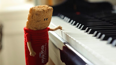
Kraft is taking a different approach to the traditional food mascot. Instead of the cheery, chipper mascot, the company has placed a troubled little character with an identity crisis at the forefront of their new MilkBite product line. The character’s name is Mel, referred to as Mel the MilkBite. The product is a mixture of granola and milk ingredients. The advertising campaign features print ads and commercial spots. Here are a few examples:


Typically, we imagine a brand's mascot to be excited and happy about the product, so this is a rather interesting take on traditional advertising. So, Mel is confused... and perhaps a little stressed. But, Mel also happens to be adorable, this cute little granola bar wearing a red MilkBites outfit. The advertising definitely plays on the viewers emotions. Not only is Mel the MilkBite visually appealing, with crisp coloring and smooth animation, but the viewer will likely empathize with the little guy. This mascot is made of two parts: milk and granola. When introduced in the commercial, Mel is struggling to figure out exactly who he is. Hmm... this concept is not entirely foreign to me. In my own life I've been many things - a student, an intern, a writer, a geologist, a designer, an educator, a volunteer. The list could go on and on, but the point is Kraft has created an ad campaign centered around the idea of being different things. Sure, oftentimes this may create a bit of stress in our lives, but we manage to pull through time and time again. Mel represents this mixture and his story is interesting enough to attract an audience. Being a little different quite possibly will work in Kraft's favor for this campaign.


The visual design and layout is rather simple. Mel remains the central focus for the commerical ads, which tells his story in stages. The print ad utilizes only two colors, featuring large text to display a unique headline message. The use of two colors eliminates any distraction, where the audience simply focuses on the central message of the ad before moving to the Kraft MilkBite logo and the outline of Mel. The Kraft MilkBite logo is located in the upper right corner, while the outline of Mel is located at the bottom. Text underneath Mel indicates that the headline is "a message from Mel". This is a nice tie-in to the commericials because it follows along with Mel's story and therefore reaches out to a larger audience.


http://www.adweek.com/news/advertising-branding/ad-day-kraft-milkbite-bars-138224


Friday, February 17, 2012

Expecting? Target Already Expected That!


This week's New York Times Magazine features an article entitled "How Companies Learn Your Secrets" - offering a look inside how retailers like Target track and analyze shoppers habits and lifestyles to produce specific, targeting advertising. Upon reading the article, I realized it touched upon many of the concepts we've been discussing in class, particularly about reaching prime prospects.

Target has developed a computer algorithm to determine not only if a customer is pregnant, but what trimester she's in and when she's due. The equation takes into consideration everything from buying more vitamins, to switching from scented to unscented lotions (common when a woman is nauseated in her first trimester) to purchasing larger purses that can double as diaper bags. Based on past and current purchases, the retailer can then send her timed emails and coupons for maternity clothing, baby supplies, etc. The sooner they can predict and identify these "future mommies," the more likely they are to convert her to a lifelong Target customer for all her purchases. They have even figured out what day to send emails to the customer so she's most likely to spend more money.

How accurate is this complicated formula? The article gives an example of a father angry because his teenage daughter received one of the so-called "baby mailers" filled with coupons for diapers and maternity clothes from Target. He confronted the local store manager, accusing Target of encouraging teen pregnancy, but a few weeks later, returned and apologized to the manager. It turns out Target was right and he was wrong - his daughter was due that summer, she just hadn't told him!

I experienced something somewhat similar to this personalized marketing while planning for my wedding two years ago. The moment my Facebook status changed to "engaged" - I was receiving emails and mail left and right from bridal shops, cookware manufacturers, diet pill companies (because, as I was told by one Facebook ad, "No one likes a fat bride!"), and more.

I can see where retailers are smart to be on the lookout for new customers and more business, within reason. I'm all for sending strategic advertising to parents who have a baby registry through Target - these customers are agreeing to share their info in return for a service Target provides - but something about mailing diaper coupons to a 17-year-old just doesn't sit right with me.

Thursday, February 16, 2012

An Advertising Design On a Different Scales


This advertisement ran in Denmark in 2011 and honestly just blew my mind. The city bus has been literally transformed into a three dimensional billboard for the Copenhagen  Zoo. Bates Y & R was the advertising firm that lead this campaign for the zoo. The ad design is just simply insane, it makes you believe you're seeing something you're really not and it just wraps you in...no pun intended. 
The contrast of the bright yellow bus against the large darker shaded snake along with the detailed shadowing really makes this ad pop. In the focal center you can read the word, "Zoo" which after seeing this ad, I would love to go. It makes you curious and makes you feel like you're already there. 

It was said to be on the best advertisements of 2011 with the help of creative director, Ib Borup and art director, Peder Schack. 

House or Billboard?


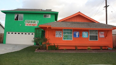
Brainiacs from mars is a specialized marketing agency scheming to turn homes into Billboards.  The idea is that residents can apply to rent out the front of their house to Brainiacs From Mars (BFM) in return of a monthly rent of about $2000. According to CEO Romeo Mendoza, 38,000 homes worldwide have applied to turn their home into advertisements.  The goal of the company is to have 1,000 homes across the U.S. turned into Billboards promoting BFM. Although zoning laws and city codes could pose a threat to Mendoza’s goal. 

What does this mean for the housing market?  Mendoza thinks his idea could help homeowners who are struggling to resist foreclosure and eviction, “People are hurting, and struggling to stay in their homes.  If we can help some of them, that would be great”(Reuters).

 It seems like BFM’s scheme is a win-win situation for both the company and the residents.  The only people who opposed the idea are the neighbors. How would you feel suddenly living across the street from an enormous billboard?

Retrieved From:

IS TELEVISION BECOMING OUTDATED?

Traditional television consumption is losing consumers.  Americans are beginning to stream their beloved T.V. shows online instead of watching regular cable.  According to Nielsen Cross-Platform Report, consumers aren’t canceling their cable, they are simple upgrading to broadband to stay connected to the internet.  Nielsen wire reports that this emerging group of consumers who prefers streaming online video is small but growing.  American homes that pay for both cable and broadband increased 5.5% since last year. 
People watch more online video content in America, but what about the rest of the world?  Report: How people Watch – The Global State of Video Consumption from Nielsen wire highlights some key trends of global video consumption.  70% of global online consumers watch online video.  Furthermore, half of global online consumers view their video content in the workplace.  Does this hinder efficiency in the workplace?  Are employers paying people to watch movies at work? 

Obviously, consumers have progressed since the days of one T.V. per household.  Now there are so many screens to view our video content; smart phones, iPads, laptops, flat screens, HDTV, 3D T.V., etc.  One can only ask, what effects does this have on society?  Do we gain knowledge from video consumption? Is an ever increasing viewership good or bad for humankind?  

Information retrieved from:


Dents on your car? How about your head?


This advertisement, from a safety organization created in Europe, headlines---“Without a seatbelt, a crash could be deadly. Even at 20KM\H.” The subtitle…In town, car accidents don't just to cars.

This is a very blunt way of saying you can get severely hurt or dead. The picture is the whole focal point of the advertisement, you can not read anything first, only look at the visual. This safety advertisement is doing a good job by throwing the truth right at you, along with a ironic and catchy head and sub line. At first, you are just shocked at what you’re looking at. Then, after reading, it comes together like a puzzle; hits you hard.

The main thing that affected me; what made me say, “wow,” was the fact the dent on the young man’s head did not look like a typical dent, it looks like a dent on a vehicle. I think this is a great statement and point. So many people worry about the dents on their car, the little things or the accidents. And when you watch the local news, you see the remains of cars after horrible accidents. Well, there is someone in that car. When people hear the words that alarm; car accidents, the first word you hear is car. This advertisement is informing you in a direct, somewhat scary way that it is just not the car. Very effective.

http://www.designsitesup.com/?level=picture&id=1537

Wednesday, February 15, 2012

"Open All Winter"

These ads by Calgary Farmers Market are wonderful. I have never heard of the Farmers Market before, but seeing the ad surely made me stop and stare at it for a second. Not only do these ads make good use of white space and catch the eye, but they get a great point across. Going to the grocery store in the winter and trying to find fruits or vegetables that don't look disgusting to the point where you don't even want to buy them can be a challenge sometimes. The copy, "Open all Winter" is simple, yet gets the point across easily. There really isn't much else to say besides that, and people like simple, therefore I think that this ad is an extremely appealing one.

Some Interesting Ads


Real Fish and Real Water Ad


Elm Grove Police

These are some billboard advertisements I came across the other day. I absolutely love the creative take on the fish billboard. It actually has real water and real fish. The ad is amazing and is new creative way to draw attention from people. There is not much to the ad but when you take a second look you realize those fish look real, well because they are real. The design of the ad is awesome. The copy is on point because it meshes with the realness of the ad. The only downfall would be that it probably has constant upkeep. The fish could die at any moment and you have to constatly worry about feeding, and hoping nobody messes with the ad. As you can see in the pictures it is an actual fish tank. I think Franke Fish got a heap of new customers by using this ad. It makes you think that their fish are the freshest.

The other ad I came across was the Elm Grove Police ad. It measures your speed like any of these other speed radars. It has a twist though it puts days in hospital bed next to your speed. This copy is great for this ad. It is subtle but it appeals to your heart. People may now think about going slower through this area. It is a great ad to make people think about their speeds. It is designed perfectly without too much detail. I hope to see more ads like this in the future.

Tuesday, February 14, 2012

WMF Knives


I saw this ad an immediately knew what was being advertised before I even read the caption at the bottom, so to me it was automatically great. This ad for WMF gourmet knives is super clear and straight to the point. The background is plain, placing all your attention to the bring orange carrot in the middle of the picture. You are not distracted by anything else. The carrot is on a cutting board where it has been chopped, only the cutting board has been sliced through as well. The places where the blade went through the cutting board is obvious. This implies that the knife used to cut the carrot is so sharp, that it can cut through something as solid as a piece of wood. We use cutting boards to stop the marks a knife can leave on a countertop if the blade hits, and this pushes the idea that this knife is so sharp, it will go right through a cutting board.

The caption at the bottom right corner says "Sharper than you think. The WMF Grand Gourmet knife with Damasteel blade." This caption simply tells the name of the knife. The WMF logo is show as well. The words are small, leaving the picture speak for itself (which it totally does).

This ad is an A+.

Photo Retouching in Advertising- Yay or Nay


Recently Glamour Magazine came out with an article focusing on photo retouching being used in reader's personal pictures, magazines themselves, as well as advertisements. The article delved into the ethics behind photo retouching, what was considered fair game and what was a no go.

Glamour conducted a survey of 1,000 women from the ages 18-40 and found some interesting data. 60% of women thought it was okay to retouch their own photos, while 43% thought it was okay for magazines to do so and 39% for advertisements. For those who felt it was acceptable for magazine/advertisements to retouch photos, the reasoning behind retouching was only okay with readers if it dealt with the removal of blemishes, stray hairs, or wrinkles in clothing. However, only 22% thought it was fine to make a woman look 5 pounds slimmer.

So then, what kind of retouching is acceptable for advertisers to use? From the above picture you can see two obviously different pictures of Britney Spears, the original and then the retouched. As for blemishes, stray hairs, and wrinkled clothing, not much seems to have been altered. The only "acceptable" alteration would possibly be Britney's bruises. Otherwise, both her waist and thighs are noticeably slimmer.

As advertisers we are selling a product and want to showcase the product's sponsor in the best light possible. This usually means their most beautiful, and often skinniest version. However, how far is too far when altering their body image. Especially for beauty and fashion products, sponsor's body size can have a great impact on the target audience.


All in all, a little photo retouching is necessary to convey the best side of the product and sponsor. However, editing a person's body to unrecognizable and unattainable standards is going too far. Advertiser's also have to think of how they are affecting their audience socially and mentally. What do you think? Is photo retouching a Yay or Nay?

This ad was found at http://www.thehollywoodgossip.com/2010/04/britney-spears-pictures-unaltered/

In An Absolut World


Absolut Vodka produces some of my favorite ads. They are always witty and entertaining, going after their customer's desires for a more rich and fulfilling life.

Absolut's campaign as a whole focuses on "what if everything in the world was a little bit more Absolut? It’s not necessarily about perfection, but about making the world better by seeing it with fresh eyes". Other ads by Absolut include police and protesters fighting with pillows, factories producing bubbles instead of smoke, and Times Square filled with works of art instead of advertisements.

In this particular ad, the emphasis is placed on the woman in which her husband is the one who is pregnant and she is able to enjoy a drink. It makes you think of that perfect world, and plays more on the target audience's heart rather than the mind. Right away the viewers attention is grabbed, because you can tell something is a bit off. And what woman doesn't relate to wanting their husband to bare the brunt of pregnancy, while they enjoy a nice martini?

It is because of this clever visual that the audience is forced to go in for a second look, and then relate the story back to Absolut Vodka. All in all this campaign was a win for Absolut.

The picture and background for the ad was found at http://www.absolutads.com/?p=727.

Monday, February 13, 2012

Messages in Advertising

This advertisement featuring Pamela Anderson for People for the Ethical Treatment of Animals employs two different methods of attracting audience attention - sex & emotion.

By portraying Anderson as "just another animal" and the sum of her parts, PETA plays on their audiences emotions to a point. I don't think that emotional reaction from this ad will be strong enough to excite viewers to act out and become a vegetarian. The sexual nature of the ad is much stronger and more noticeable than the emotional message.

I think that the sexual elements will be memorable, but that no one will remember really who the ad was produced by. The message is very clear and well thought out, however, other elements are much more obvious than the message.

This ad was found at http://www.getthefive.com/articles/the-boardroom/pamela-andersons-peta-ad-banned-in-canada-i-think/

Westin Hotels & Resorts: For a Better You

Element of Well-Being No. 12:
A good night's sleep is proven to reduce stress, improve focus, and better memory.
Our Heavenly Bed has been engineered with exactly that in mind.


Today, I came across an advertisement for Westin Hotels & Resorts in an issue of Self Magaine, which is fitting because the ads focus on the well-being of consumers. It was not the ad above, but it was similar and featured the same basic information, including the headline, "Element of Well-Being" and the slogan, "For a Better You." Because the ad was numbered (ex. "No. 12"), I decided to see what other ads the hotel chain had produced. 

Of the ones that I found, I liked this one the best. I felt that the image best-represented the message: getting a good night's sleep. All of Westin's ads feature a good bit of whitespace, which in this case, adds to the feelings of comfort and luxury that the company is trying to convey. The ads are very delicate and cater to the emotions of the viewers. Westin wants their consumers to know that, when choosing a hotel or resort for travel, they can rely on the company to deliver a relaxing and utterly enjoyable experience. It is company's goal to make you feel comfortable.

I believe that this ad communicates that message well. It is very light and "airy" and makes you want to relax for the night in a super-comfortable Heavenly Bed. They even make the bed of balloons look wonderful to sleep on! The colors, lighting, and type selection all work well together to create the look of comfort and relaxation. Though the ad uses only grey and white, there is enough contrast to keep the viewer interested.

The emphasis is on the balloon bed in the center of the ad, with the use of bright white and additional lighting effects. This is how the viewer is introduced to the idea of comfort and well-being. However, the rising balloon to the left of the ad moves the viewers eyes upward to the copy of the ad, which explains, in more detail, the offerings of Westin Hotels & Resorts. Your eye then travels to the bottom right corner where you see the name of the hotel. 

I was impressed with the ads that I saw from Westin and believe that they have a great campaign to accomplish their goals. I feel relaxed when I look at their ads, but also want to experience the luxury of one of their resorts. Also, I think the idea to number the benefits on the ads was a great addition. It makes me wonder what other perks the company has to offer my health and well-being.