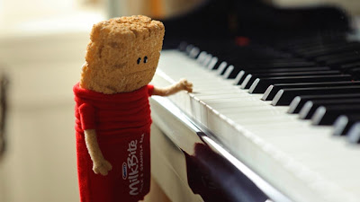
Typically, we imagine a brand's mascot to be excited and happy about the product, so this is a rather interesting take on traditional advertising. So, Mel is confused... and perhaps a little stressed. But, Mel also happens to be adorable, this cute little granola bar wearing a red MilkBites outfit. The advertising definitely plays on the viewers emotions. Not only is Mel the MilkBite visually appealing, with crisp coloring and smooth animation, but the viewer will likely empathize with the little guy. This mascot is made of two parts: milk and granola. When introduced in the commercial, Mel is struggling to figure out exactly who he is. Hmm... this concept is not entirely foreign to me. In my own life I've been many things - a student, an intern, a writer, a geologist, a designer, an educator, a volunteer. The list could go on and on, but the point is Kraft has created an ad campaign centered around the idea of being different things. Sure, oftentimes this may create a bit of stress in our lives, but we manage to pull through time and time again. Mel represents this mixture and his story is interesting enough to attract an audience. Being a little different quite possibly will work in Kraft's favor for this campaign.
The visual design and layout is rather simple. Mel remains the central focus for the commerical ads, which tells his story in stages. The print ad utilizes only two colors, featuring large text to display a unique headline message. The use of two colors eliminates any distraction, where the audience simply focuses on the central message of the ad before moving to the Kraft MilkBite logo and the outline of Mel. The Kraft MilkBite logo is located in the upper right corner, while the outline of Mel is located at the bottom. Text underneath Mel indicates that the headline is "a message from Mel". This is a nice tie-in to the commericials because it follows along with Mel's story and therefore reaches out to a larger audience.
http://www.adweek.com/news/advertising-branding/ad-day-kraft-milkbite-bars-138224

I love these ads! Somehow, Kraft has made granola seem cuddly and adorable.
ReplyDeleteI do think it is interesting how much this new mascot resembles Kellogg's frosted mini-wheats characters, though. Could there be a cereal mascot showdown at some point in the near future?
.
ReplyDeleteThe entire "Tragic Mel" marketing campaign for this
product is so racist and offensive on so many levels
(For example -- the reinforcing of the false and racist
stereotype of ''The Tragic Mulatto'; the reinforcing of
the stereotype of “the closeted-racist White person”
who chooses to 'Fetish-ize’ and / or ‘Objectify’ either
Interracial-Relationships, Mixed-Race / Multiracial
people or People-Of-Color, in general – and worse
yet, expects them to “enjoy it”; etc.) – that one is
led to wonder “What on earth was the marketing
department thinking when they approved of then
created this unnerving and offensive nonsense?”!
.
By the way – listed below, please find links that were
created in HONOR of interracial relationships and of
mixed-race / multiracial people and groups. =D
http://groups.yahoo.com/group/Generation-Mixed/message/4162
https://www.facebook.com/allpeople.gifts/posts/452738141409383
.