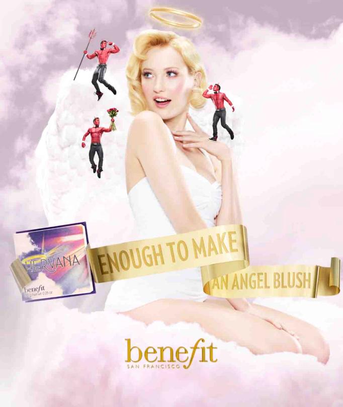
Cosmetics company Benefit released a new version of its popular “blush in a box” early this year – a multicolor shimmery powder called “Hervana.” It has a variety of print ads and department store posters advertising the new product, but all of them feature the same idea as shown above: an angelic model sits in the clouds, surrounded by devils, while a golden ribbon below displays the product slogan, “Enough to make an angel blush.”
The design of this advertisement works on several levels. First, the model looks like the famous “Vargas girl” illustrations of the 1940s. This is consistent with Benefit’s brand identity – most of their products and packaging have a vintage, pin-up theme. Also, the ad uses humor to engage the viewer. The devils, handsome suitors trying to win the angel over with flowers and charm, play on the common theme of temptation, or a devil on one’s shoulder. The slogan is a play on the word blush, and ties the ad together.
The ad makes good use of color, using light pinks, purples, and white for an angelic, ethereal feel. These are also the same shades as the blush itself. The gold of the angel’s halo and the ribbon with the slogan continues to play on these ideas of heaven, innocence, and beauty.
The layout is also effective. It draws viewers’ eyes onto the model, and then to the product package and the slogan.
The one improvement I’d make to this advertisement is to actually show the open box with the blush. Many Benefit customers who see this ad would already know to some extent that the product being advertised is a blush, thanks to the caption and the box, but new audiences may be confused. Also, it would help to see what colors are actually in the package. Finally, I would include a company website at the bottom of the advertisement, as ads need a call to action of some sort for customers to learn more.
No comments:
Post a Comment