The "breakfast wars" of 2015 saw the introduction of McDonald's all-day breakfast menu and Taco Bell's breakfast offerings. The two massive franchises fought to secure their positions as "the" fast food breakfast. While McDonald's did heavily advertise their new all-day menu, their ads were nowhere near as direct and adversarial as Taco Bell's, who put out a short film and 1984 propaganda-style posters suggesting that McDonald's was some sort of mandatory, "routine" breakfast, encouraging consumers to rebel by switching to a Taco Bell breakfast.
This particular ad features an approximation of McDonald's famous Ronald McDonald mascot, and depicts what is presumably the Egg McMuffin as a bland, cylindrical food.
McDonald's opted to respond with a facebook post, a photo of a small, frightened chihuahua, Taco Bell's famous mascot. The caption read "imitation is the sincerest form of flattery." This response was incredibly simple, relied solely on the established and familiar iconography of these brands, and, in my opinion, sent an effective message about how McDonald's viewed the Taco Bell campaign in the most straightforward and hilarious way possible.
Since Apple introduced the new iphone xs and iphone xs max, Samsung has also put effort into releasing a new smart phone which can compete to Apple. In last month, Samsung finally introduced the new Galaxy S10. I found an official introduction advertisement of Samsung and also an advertisement of Apple to compare both of them. These two ads will be displayed as below.
In Apple’s ad, the first impression it gave me is simple and luxury. This ad just uses simple way to show us what’s the new iphone looks like and what kind of screen size they will release. It also comes with enjoyable background music which can attract audience to go to retail store to see the real phone. Apple used just 30 seconds to show us their products and even their creative imagination.
In Samsung’s ad, it is just an introduction ad. In this 4-minute video, audience can gather all information they need to know the new Galaxy S10. All new functions and new cameras are introduced in this ad. This kind of ad can make audience know if this phone and its functions are real their need. Samsung also used this ad to show some new technology which can compete with Apple.
In short, Apple’s ad is much simple and easy to get information from. Some audience would like this kind of ad. Maybe they don’t like the kind of ad which is too long such like Samsung’s. However, this kind of ad is good for those audiences who want to know the details of the new product.
Since March is Women’s Month, there are many ads that have
aired recently that are sure to represent women. Two brands that have successfully
captured the purpose of the celebration of women everywhere and ran with it are
Adidas and Nike. Not only do both brands have commercials that are extremely
talked about and well known, even after they’ve only been airing for a short
time, they also both have series on their YouTube channels that highlight extraordinary
women and their athleticism. So, not only are the brands very similar, as they
both serve practically the same function of distributing athletic apparel, they
also share the same common interests of where we are as a society currently and
the politics of sports and athletes.
One specific ad from both brands that is for Women’s Month are
the commercials titled “Nike – Dream Crazier” and “She Breaks Barriers: MoreVisibility. Bigger Dreams”. Both ads are for women, showing only women. The
Nike commercial actually launched February 24, 2019, beating Adidas to the
punch by two weeks (March 7th , one day before International Women’s
Day). One might assume that the closeness of launch dates could be specific as
to say Nike aired their commercial before March for the intention that March is
Women’s Month, and Adidas launched their commercial the day before International
Women’s Day in celebration for that day. Needless to say, though, both of the brands
took two different approaches with their commercials. Overall, they both effectively
represent women’s rights movement and its impact on women of all backgrounds
who continue to strive for change. (Watch the commercials below)
"Hey, I'm Paul, and I used to ask 'if you could hear me now?' with Verizon. Not anymore." Remember this guy?
Honestly, I didn't remember Paul at all when he was Verizon. But when he made the switch to Sprint? That's what made Paul memorable. To me, it's a bit of a low blow to steal another company's spokesperson. As a bit of a cynic, I imagine that Sprint is just offering the actor who plays Paul more money than Verizon was. I hardly believe that Paul is a real customer who decided that he likes Sprint better, but yet, I still believe what he says. It even resonates me.
Aside from the fact that Paul's switch seems more like a bribe than genuine customer loyalty, what he says catches your attention. With the advancement of technology, network coverage and speed is no longer noticeably different from one wireless provider to the other. That's what Sprint capitalizes on. Their coverage is basically the same speed, but Sprint claims that its price is under half of Verizon's. To most consumers now, that's what matters.
It seems like the trend of taking direct shots at your competitor is becoming more and more popular. For example, Wendy's is a flat out troll on Twitter. Everyone hates trolls, but everyone loves Wendy's Twitter account. There's something personal about businesses talking dirt on their competitors. As consumers, we want to lean in and say, "yeah, McDonald's beef is definitely frozen — I'm glad Wendy's is calling them out."
When a company gets slightly unprofessional and starts talking "at" their competitors instead of just "subtweeting," it makes them more human. It's like these advertisements break down the barrier between company and consumer. In a world where everyone is busy showing off their highlight reel of accomplishments, it's refreshing to hear a company spokesperson level honestly with you...even if they're probably getting paid a lot of money to read the script and make it seem genuine. For me, it works.
It’s hard to compare on even ground two competitive brands. In looking at Starbucks and Dunkin Donuts, both are American-founded coffee companies. Dunkin Donuts was founded in 1950, giving it jumpstart in comparison to Starbucks, which opened in 1971.
Dunkin Donuts has gotten a reputation of being an east-coast favorite, affordable coffee option, and quick breakfast go-to. The menu ranges from donuts, eclairs, bagels, breakfast sandwiches, drip coffees, lattes, and other speciality coffees. It has expanded from just donuts and coffee, to a more expansive menu for not just treats but as on-the-go breakfast meals. Most Dunkin Donuts’ offer a drive-thru, honing in that idea of on-the-go. This aligns with the brand slogan, “America Runs on Dunkin.” It’s efficient, quick, adorable, and tasty.
Starbucks, on the other hand, has only recently extended their stores to having drive-thus. Drive-thrus weren’t as common with the company in their origins, but have become more widely added to franchise within the last decade or so. The delay was to uphold brand reputation of a more upscale, elevated, and deluxe. Starbucks has a brand image of being a more trendy and posh coffee choice. This is scene in their logo, typography, aesthetics, store layouts (couches, coffee tables, hardwood floor, bookshelves, etc.) Their menu is also more plush in comparison to other coffee chains; blonde lattes, speciality drinks, cold brews, nitro brews, croissants, banana bread, oatmeal, tomato + mozzarella paninis, etc.
So in having two ads to compare, I chose to level the playing ground a bit and look at holiday-timed ads for the two brands.
In looking at the Starbucks holiday ad, the layout and copy are simple: featuring very recognizable Starbucks red holiday cups. With the Starbucks logo on it.The three cups are lined up one behind the other, the foam from the coffee drinks is decorated lightly in cinnamon or some spice that, together, the three cups make up a snowman. It is effective, creative, and simple. The latte art isn’t tacky or outwardly seen. It is subtly designed but still noticeable. It adds a nice touch to the simplicity of the rest of the print which is on a clean red background with small white copy that reads “The holiday drinks are here” It’s simple, understated, but very effective and original. It’s displays their seasonal specialty drinks, the quality of them, and focuses on the idea that these are seasonal - so get them while you can. It’s not explicit, but it does hone in on that idea of deluxe and exclusive.
The Dunkin Donuts ad features a Dunkin latte cup with a speciality drink. The cup says “Latte Sugar Cookie” and features red and green sprinkles to add festive decoration on top of the latte foam. The copy is read more boldly and in a bigger font compared to Starbucks. The copy reads “Enjoy the magic of the holidays” in the Dunkin-styled font. The message in this ad circles more around the charm of the holiday season and festive joy. Unlike Starbucks, the type of seasonal drink is told to the viewer. Starbucks ad had no information about what their seasonal drinks actually are. This could be because their seasonal drinks are popular and stay the same nearly ever year (Peppermint mocha, chestnut praline, etc.) Whereas Dunkin will release different flavors every few years (sugar cookie, snickerdoodle, Peppermint mocha, etc.)
The Dunkin Donuts logo appears at the bottom of the print in Green/Red colors, as opposed to their traditional red/orange Dunkin Donuts colors. It is clear that Dunkin Donuts made their ad more festive and seasonal. Whereas Starbucks remained rather on-brand with their colors and design. They remained rather on-brand with exclusivity, where Dunkin was a little more seasonal.
I personally favor the Starbucks advertisement, simply because its more creative and seems like more thought was put into it. The Dunkin, although is festive and fun, isn’t really special or outstanding. That being said, I think the adds are both appealing to their demographics. Dunkin isn’t trying to be exquisitely exclusive; they are trying to be fun, appealing, and attractive to an audience that desires quick and tasty service. Likewise, the analyzed Starbucks appeals to the exclusivity of its brand and creates a more aesthetic and creative print. Works Cited: (n.d.). Retrieved from http://arvani-designs.com/portfolios/dunkin-donuts-holiday-ads/ Starbucks Christmas 2013 | simplistic promotional posters | Pinterest | Christmas ad, Starbucks christmas and Christmas poster. (n.d.). Retrieved from https://www.pinterest.com/pin/528891549963133460/
There are two main competitors in the smart phone industry: Apple and Samsung. Both tend to be very successful and whether you're pro Apple or pro Samsung will not be discussed in this blog post. We are solely looking at these two print advertisements from the competing companies.
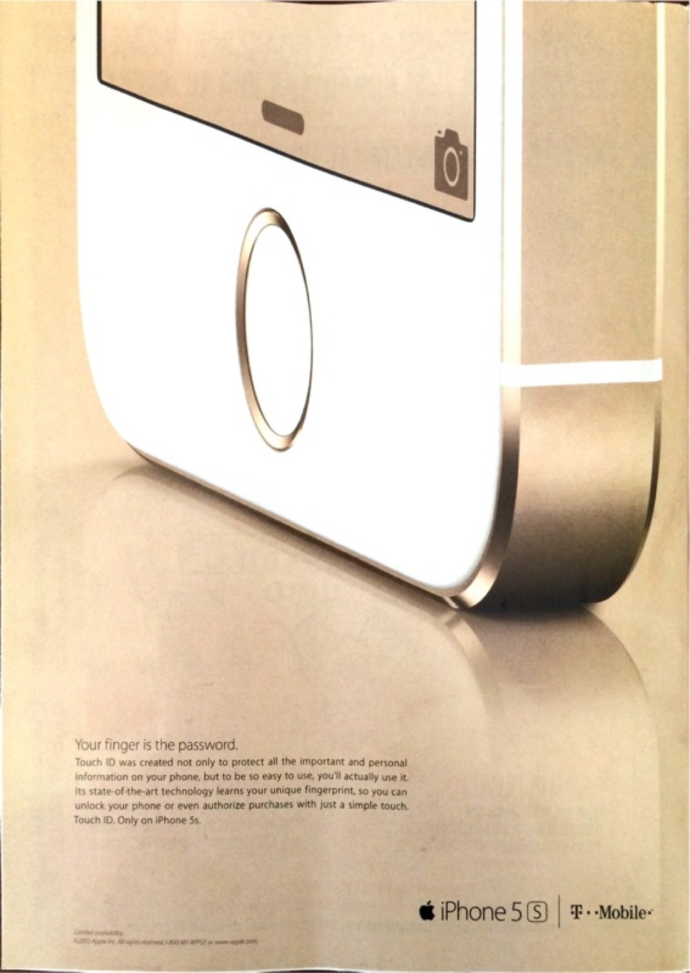
Apple is well known for their simple advertisements. Usually when they put out a print advertisement, they take one aspect of their product and promote only that aspect with a description. Sometimes it is sleek design, sometimes it is a feature of the phone, and in this case, it is the new Touch ID technology that they offer with their new product. However, while promoting this technology, they are also displaying the sleekness of their products and the simplicity in design. In doing so, it is easy to focus on the new technology and also tell it is for Apple because of their consistent simplicity. In addition, it will keep the audience's attention because it is a short advertisement. However, they are also relying heavily on their products being well known, as they are only promoting one aspect of their phone.
Samsung is one of Apple's biggest competitors. When they put out advertisements, they tend to focus on their new technology and their advancements. In their advertisement, they are focusing on all of their features of their new phone and comparing it to Apple, because Apple does not have as many or as nice of features. Discussing all of the features can be very beneficial, especially comparing right next to an Apple product, because it allows people to see what each product has to offer and decide what would fit their needs. This also works because a lot of people in technical industries like to have the best technology and are not brand loyal. They just care about the better working and the nicer phone. However, it can also backfire because there is a long list and it may lose people's interest faster.
These advertisements have shown that you can take at least two routes when promoting technology products. You can use simplicity and base everything off of the fact that people know your company and advertisements and, usually, the consumers are very brand loyal. Alternatively, you can use a technological advantage and show how your product is the best on the market and how it compares directly to other products. As both companies are very successful, both routes tend to be successful, as long as you know your audience!
One might not think of the battery industry to be competitive, but it is. The two leading competitors are Duracell and Energizer. Both of these giant brands have pink bunnies as their mascots. But how did these companies end up with similar mascots? Duracell originally had the pink bunny but in 1988 their trademark lapsed and Energizer took the opportunity to play on its success. Yet they are different and Duracell cited the pink bunny as a species for their brand with multiple bunnies whereas Energizer has the one bunny.
Personally, I never realized that Duracell has a pink bunny as well. I always thought of the Energizer bunny when I thought of batteries. These two brands are very competitive with each other and these ads show that.
Both of the brands play on their long battery life and always claim to be the best. Duracell focuses on being able to run longer than the average battery whereas Energizer focuses on saying they are the longest lasting battery in the market. These brands have been going after each other for years and since batteries are pretty switchable, they try to get loyal customers. It can be hard to keep customers for such necessity product. People may not be concerned with the brand, just that it will last. This is where advertisements come in, to help people choose. Personally, I see more Energizer ads and think the bunny is cuter and classic with his little drum. Overall, both ads focus on brand characters which try to gain customer loyalty.
Method
and Mrs. Meyer’s Clean Day are vegan, earth-friendly, and cruelty-free home
care and body products. Both brands can be found at Target and range from $2.99
to $17.99. The ads below are hand soap ads for each brand.
The
top ad is for Method hand wash. It shows a woman’s hand holding a snow cone
while the snow cone syrup drips down her hand. To the right, is an image of
Method hand wash. The ad is clear and concise with vibrant colors. It gives the
feeling that when hands are dirty and sticky, Method will clean them.
The
bottom ad is for Mrs. Meyer’s Clean Day hand soap. With scents that are
inspired by a Midwest backyard garden, the ad portrays a woman standing on a
garden fork. A graphic of Mrs. Meyer’s Clean Day hand soap blends into the
garden and background. The ad has a bright yellow background, but is otherwise,
simple. It sends the message that hardworking hands need a good hand soap.
Both
ads are easy to read and to the point. The ads show that each hand soap will clean
hands whether they are sticky or dirty. Method’s ad might catch someone’s
attention quicker due to brighter colors and minimal writing, but Mrs. Meyer’s
Clean Day does a nice job with creativity.
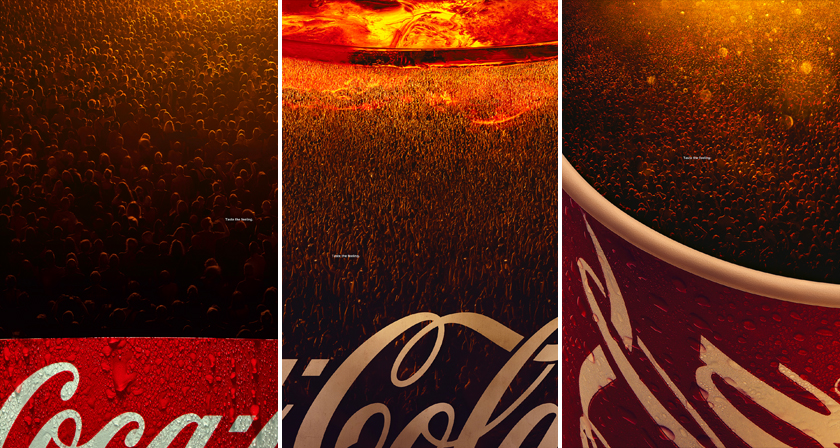
It is no surprise to hear that the global powerhouse company Coca-Cola has a rich history in advertising. From Santa Claus to the “Mean” Joe Greene commercial to the Coca-Cola Bears the company has been able to produce a number of iconic advertisements that span across multiple generations. Currently, Coca-Cola is running a campaign that has a greater focus on getting their consumer to personally identify with the brand. The “Share a Coke” campaign is all about the fun that you can do while sharing a Coke is someone special. An extension of this idea is present in some of Coca-Cola’s new print and outdoor ads.
The advertisement shows what looks to be a magnified image of their classic drink, but upon a first glance, the ad becomes much more interesting. Instead of what seems to be the bubbles from the drinks carbonatization the picture is filled with a crowd of people. The copy, “Taste the Feeling” is also placed within the crowd. The combination of this copy and the composition of the picture show that Coke is not only to sell a product but also sell an ideal. A Coca-Cola beverage is meant to be enjoyed just like an event is enjoyed, at a special time and with people that you care about. The drink, like the event, is supposed to make you feel happy and wish the experience would go on forever.
During the season of the Oscars, Netflix has a message for Hollywood directors. The "Make Room" ad is a social announcement claiming that there is a clear lack of deserving women in the film industry. Netflix uses the beloved Uzo Aduba as their spokesperson, going through her message while showing off their popular, female-driven shows, such as "GLOW" and "Orange is the New Black." Showcasing their best variety of female talent shows the academy that equal opportunity in film is possible and calls only for success. It is an emotional and moving video showing talented women, asking for an opportunity to be seen and heard, while avoiding to preach to the public.


 The Dunkin Donuts ad features a Dunkin latte cup with a speciality drink. The cup says “Latte Sugar Cookie” and features red and green sprinkles to add festive decoration on top of the latte foam. The copy is read more boldly and in a bigger font compared to Starbucks. The copy reads “Enjoy the magic of the holidays” in the Dunkin-styled font. The message in this ad circles more around the charm of the holiday season and festive joy. Unlike Starbucks, the type of seasonal drink is told to the viewer. Starbucks ad had no information about what their seasonal drinks actually are. This could be because their seasonal drinks are popular and stay the same nearly ever year (Peppermint mocha, chestnut praline, etc.) Whereas Dunkin will release different flavors every few years (sugar cookie, snickerdoodle, Peppermint mocha, etc.)